Judging a book by its cover
I know we’re not supposed to, but let’s be honest, we do. The cover art on any book, the packaging on any item, the dressing of a shop window…I could go on and on…is what we use to judge the contents before we have consumed the content. It’s the instant impact that cover art makes that will stop us in our tracks and make us pause. As writers, we have to have the same impact on our prospective readers, whether it’s through the cover art we choose or design for our books, or the first line. Oh, that elusive perfect first line!
But it’s the artwork that I am pondering today. I’m not much of a visual person, possibly because I have had rather poor eyesight all my life. I work with words mostly and paint my pictures with these rather than with watercolours, oils or even crayons. Yet I am as susceptible as anyone when it comes to book cover art, and there are some stunning examples in the bookshops. Here are some iconic book covers:
Jaws, written by Peter Benchley and cover of the 1974 edition designed by Paul Bacon. I read it in 1976, before I saw the film and when I was only 12. I have never been quite as relaxed in the sea since, and that was just the effect of the cover.
A Clockwork Orange written by Anthony Burgess and cover of the 1972 edition designed by David Pelham. I was a teenager when I read this and I remember sitting staring at the cover after I had finished and feeling as disturbed by this as I had been by the writing. It’s still unsettling.
Pride and Prejudice written by Jane Austen and this cover of the 1894 edition designed by Hugh Thomson. I have read several different editions of Pride and Prejudice since reading it at the age of 14 and there are some beautiful editions but this one, to me, is iconic.
Psycho by Robert Bloch and cover of the 1959 edition designed by Tony Palladino. This design was so successful that Alfred Hitchcock purchased the rights to it for the promotion of his film. It’s a cover design that speaks the story before you have even turned to the first page.


One thing is the cover of a hardback or a paperback on a bookshop shelf. Apparently, there is a tiny window of 15 seconds in which to attract the potential buyer. I don’t know the statistics or the research behind this but I think it stands to reason that this window of opportunity for selling a book is even less on a thumbnail online. Which means that the visual impact has to be significant and instant. A tough call which places book cover designers pretty close to being among those most important to successful publishing.
Pondering this, I wondered what we, as readers, most reach for in our bid to decide which book to buy. I guess there are a number of factors that influence our reading choices. Experience of the author, having read their previous works and enjoying them might be one. Picking up the sequel to a series might be another. Book reviews or recommendations might have an influence, or so we would be led to believe by the success of BookTok and Bookstagram and BookTube. But I think we have to admit that we are drawn to a book with a great cover, and we might pick it up and browse through its pages, and if it has beautiful illustrations and maybe sprayed edges and gorgeous end papers, it will be difficult to avoid taking it (and a few others like it) to the counter and buying.
Choosing a cover design for my own work was always quite tough for the work that I self-published; my early experiments with KDP were questionable and I am currently talking to Athena Services Limited’s Jessica Richardson about developing fresh artwork - an interesting project is in the making and more of that in a later post! I still like the cover art for Beyond the Blue. This was designed by Carmen Anderson and it touches on that childlike part of me that spawned many of the ideas for the poetry it encapsulates.
The cover art for Myth Monster Murderer is superb in my view, and I have had many comments from readers who particularly liked it. This, I think, is a great example of a cover illustration that tells you exactly what the book is about and draws you right in. Ciara Wild and I jumped at it as soon Jack Wedgbury at the Book Guild, who designed it, sent it to us for approval; we loved it instantly and still do. You can take a look in the Books section of this website, but I recommend getting a copy for the full impact of the cover and how it links to the writing.
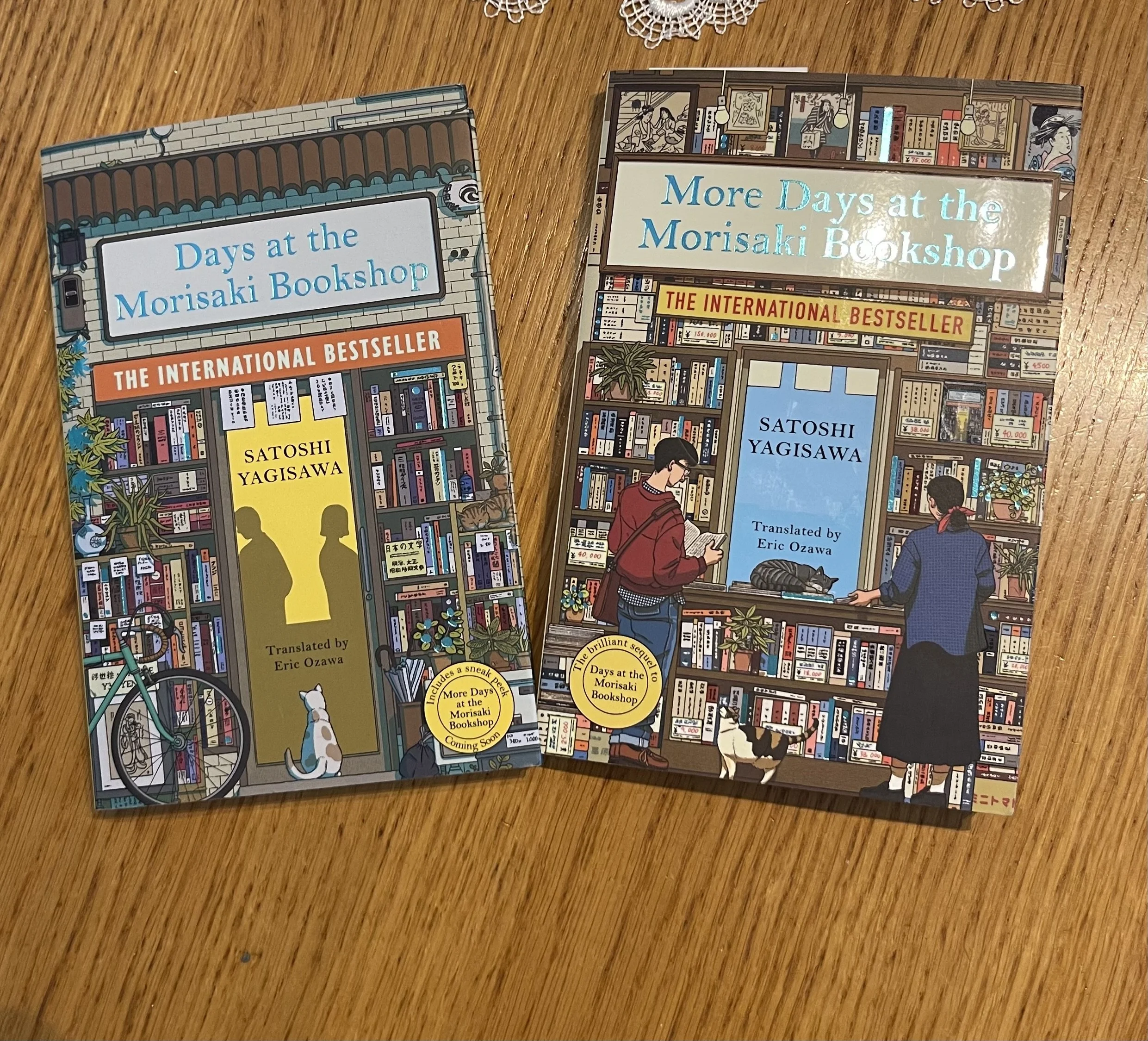
My latest favourite book cover is Days at the Morisaki Bookshop (Satoshi Yagisawa), the Manilla Press edition, designed by Ilya Milstein, possibly because it is my latest read and textured, so it feels good as well as looks good and because bookshops are my happy place and this cover held the promise of an enjoyable read. It’s also my current read and my selection of favourite varies with the day, the mood and whether I am enjoying the book. Yes, there’s a cat on the cover, and two on the cover of the sequel, More Days at the Morisaki Bookshop, next on my reading list, and no, there are no cats in the story, and I don’t care, cats, comfort, bookshops and cafes are all good things in my view and we all need more of the good things in life, particularly nowadays.
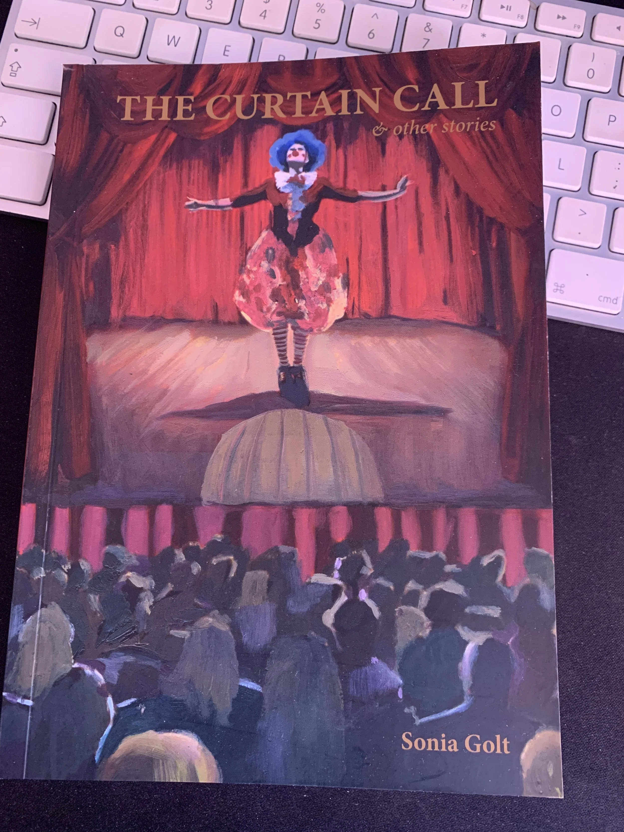
So I wrap this up with a note of appreciation to all those cover designers out there - thanks for lighting up our words with images. And I leave you with a photo of the cover of Sonia Golt’s latest publication, The Curtain Call and Other Stories. The cover illustration for this was desgined by Karl Ullger, whose artwork is pretty impressive and I thought this was a great cover that pulled you across the bookshop to reach for the book and find out more…which is exactly what a good book cover is meant to do.